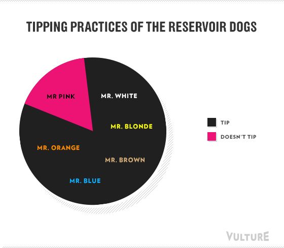
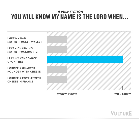
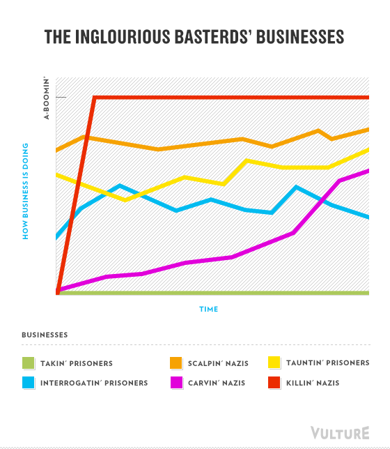
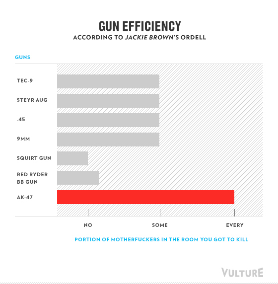
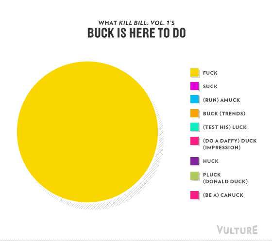
Vulture decided to make various charts and graphs (which they incorrectly call infographics) for different parts of Quentin Tarantino's films, from
Reservoir Dogs to
Inglourious Basterds. Check out my favorites below and more after the jump; click the link above for the rest!
No comments:
Post a Comment